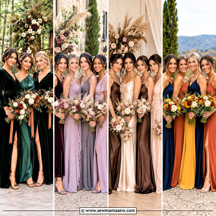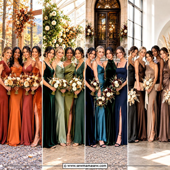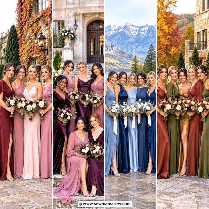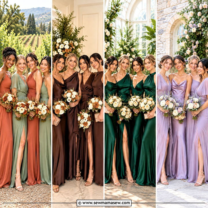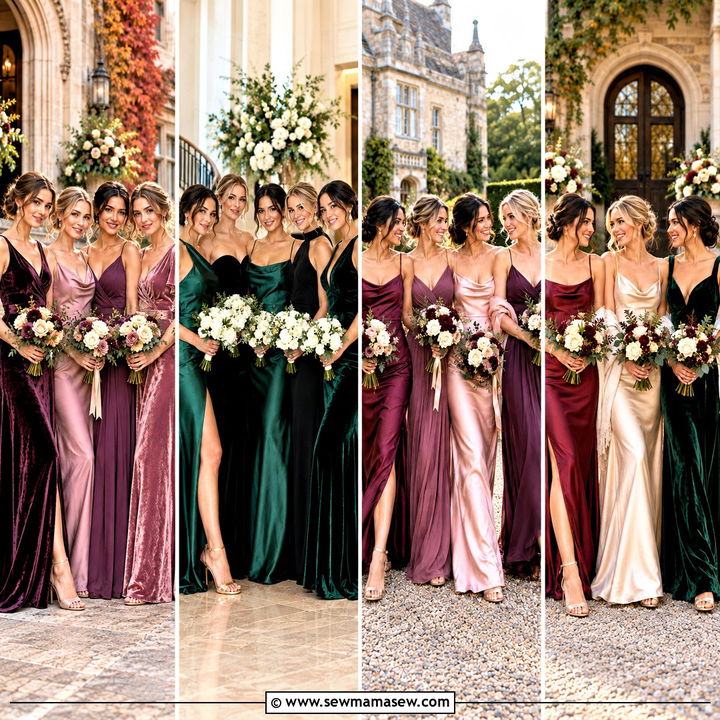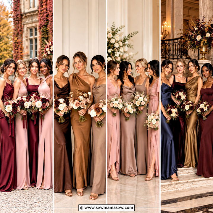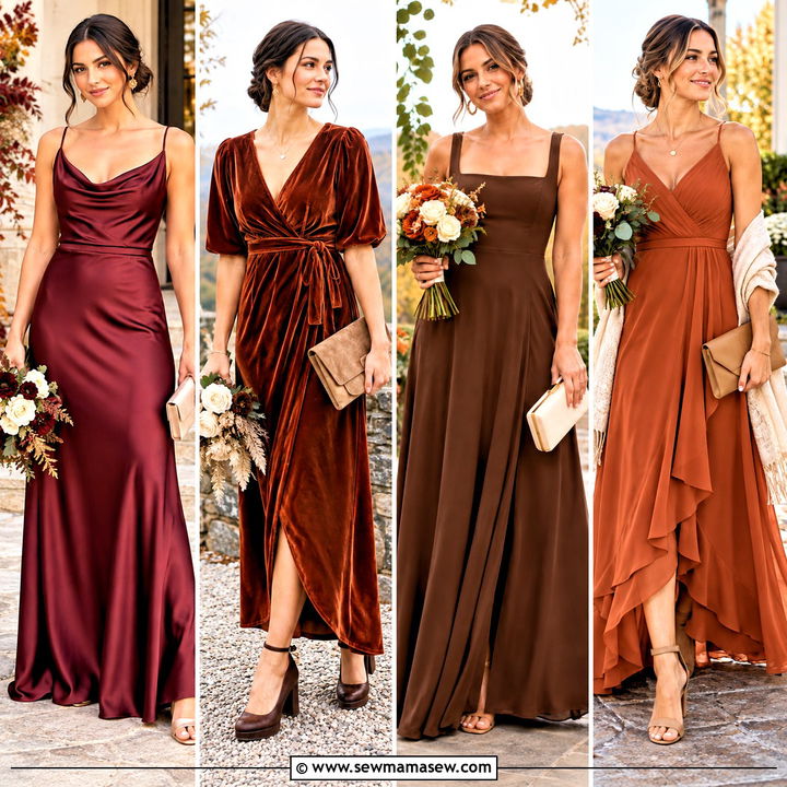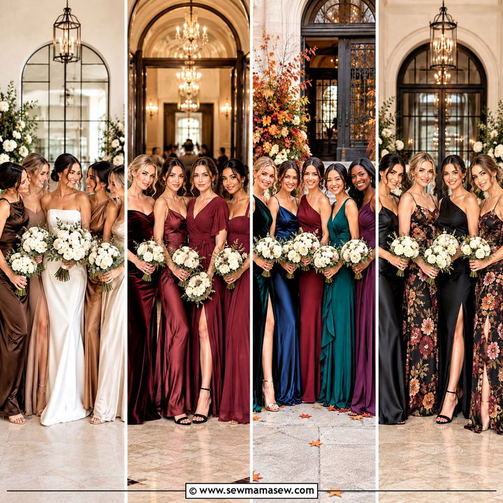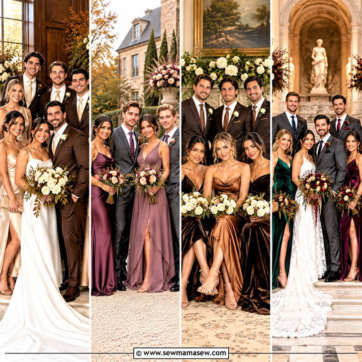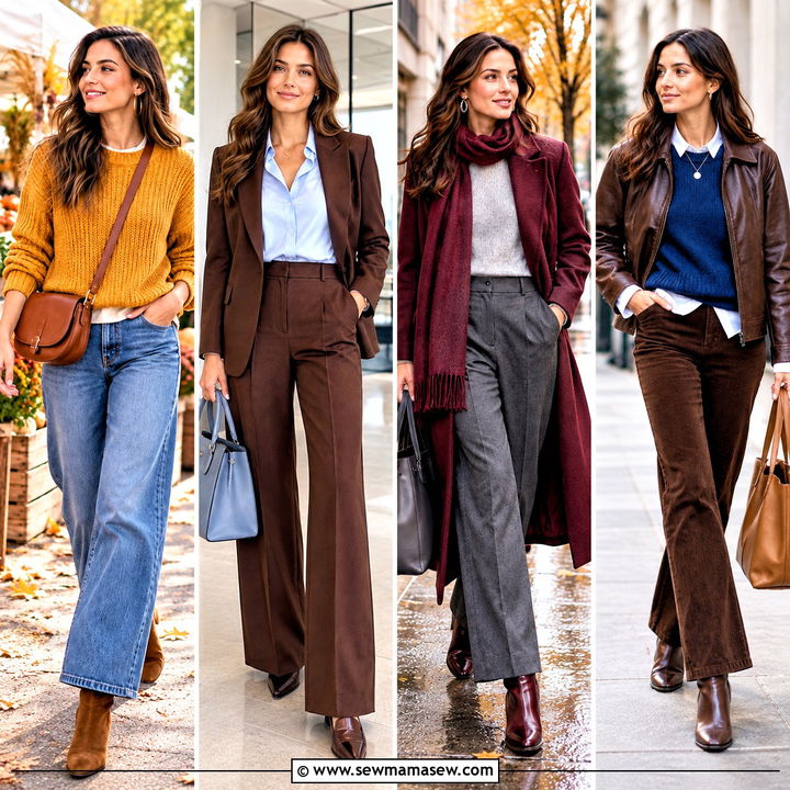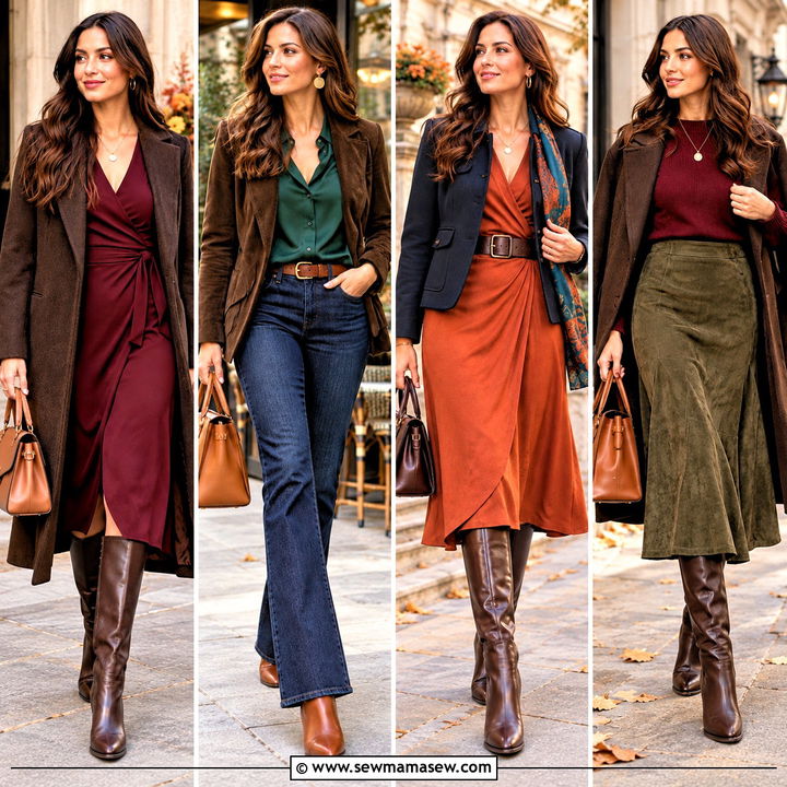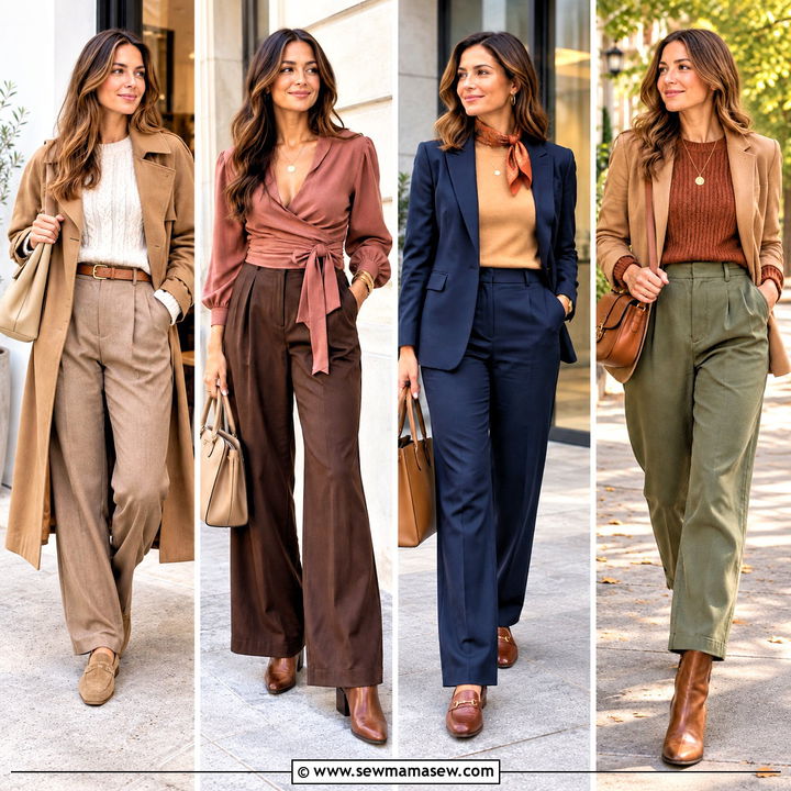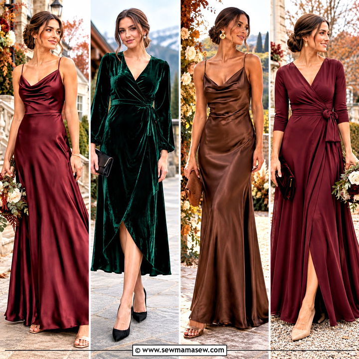
A coordinated bridal party doesn't need one identical shade. What it needs is a system: colors with related undertones, one hem length, one fabric weight and one metal for shoes and jewelry. Fall makes this easier than any other season, because burgundy, terracotta, olive, espresso, champagne and the deep jewel tones already sit comfortably together, and satin, crepe, chiffon and velvet give the group some texture. When I plan a mixed palette, I fix the length and the accessory finish first and only then let each bridesmaid pick a neckline, sleeve and fit she can actually wear for ten hours. Below are fifteen palettes I'd happily put in front of a bride, with notes on where each one goes wrong.
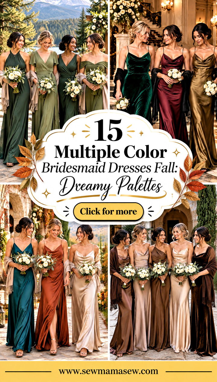
Testing a Mixed Palette in Daylight Before Anyone Orders
Screens lie about color, and fall shades lie more than most. Burgundy can look brown on one phone and pink on another, and olive shifts between khaki and gray depending on the display. So before a single dress is ordered, I get physical swatches of every shade in the actual fabric each bridesmaid will wear. A sage in chiffon and the same sage in satin are not the same color once light hits them.
Here is the order I work in:
- Lay all the swatches side by side next to a swatch of the bride's gown, outdoors, around midday and again late afternoon. Indoor bulbs warm everything up and hide undertone clashes.
- Take a quick photo of the row. If two shades merge in the photo, they will merge in the wedding album too, so swap one for something darker or lighter.
- Check the bouquet colors against the dresses at the same time. Ivory and cream are safe with almost every palette here; bright white can look harsh next to warm browns and rusts.
- Order every dress in the same week, ideally from the same retailer or line. Dye lots vary between production runs, and two burgundy dresses ordered months apart can arrive visibly different.
- Leave enough time for alterations. Most bridesmaid dresses need at least a hem, and a mixed lineup only looks deliberate if every hem lands at exactly the same point.
That last point is the one I'd never skip. Different colors are forgiven easily in photos. Different lengths are not.
1. Burgundy Rust and Mustard Fall Bridesmaid Dresses
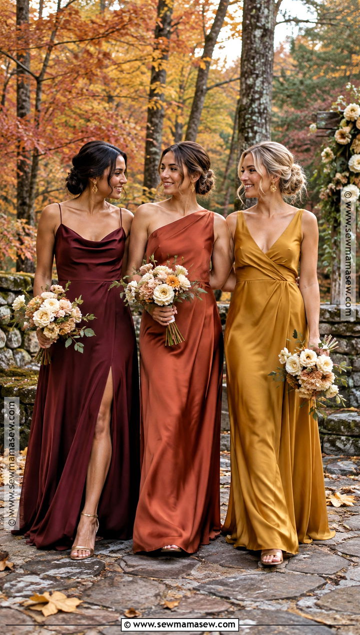
Burgundy, rust and mustard read like a hillside in October, but mustard is the color that decides whether this works. A clear yellow mustard looks loud beside burgundy; a browned, ochre-leaning one sits with it. I'd keep all three in floor-length satin or crepe so no color looks more formal than the others, and let the necklines vary between cowl, one-shoulder, wrap and square. Bronze or champagne block heels, small gold earrings and ivory bouquets with muted greenery keep the focus on the dresses. A burgundy velvet wrap handles a cold outdoor ceremony. For photos, alternate the colors down the line; three mustard dresses side by side turns into a yellow block. Brick walls and wooded estates suit this palette because the saturation holds up against a busy background.
2. Terracotta Dusty Rose and Champagne Bridesmaid Dresses
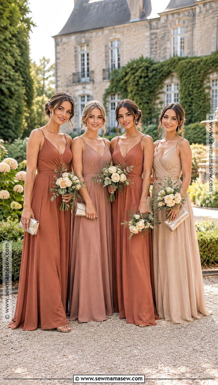
Terracotta, dusty rose and champagne is the gentlest of the warm palettes. Terracotta carries the weight, dusty rose bridges, and champagne lightens the whole row. My first check here is always the champagne against the bride's gown: hold both swatches together outdoors, and if the champagne reads as ivory, go a step darker or more golden. Long chiffon or matte satin with a softly draped skirt suits the colors better than anything stiff. Nude or pale gold heels disappear, which is the point. Pearl drops, a small metallic clutch and bouquets of cream roses, blush blooms and eucalyptus finish it. I'd use this for an early fall garden ceremony or a barn with pale wood rather than a dark ballroom, where the softer shades can go muddy.
3. Forest Green Olive and Sage Bridesmaid Dresses
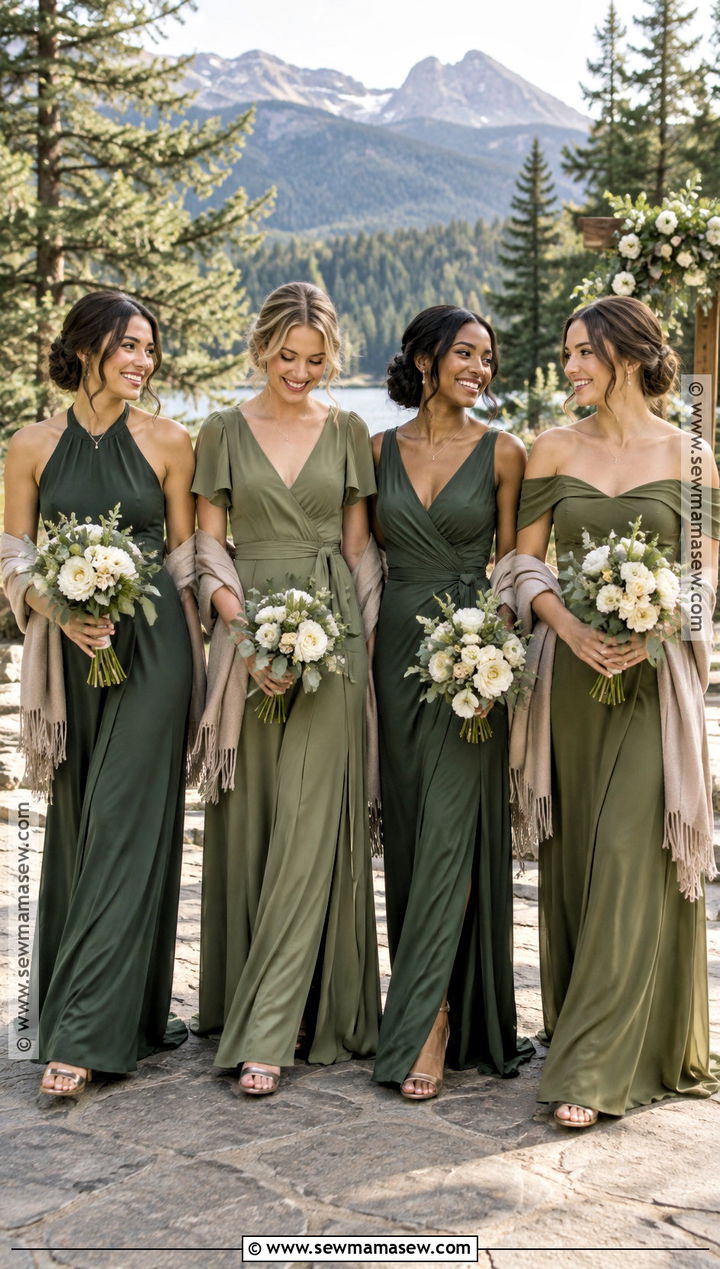
Three greens is the palette I suggest most often for an outdoor fall wedding, with one warning: green on green against green trees can disappear in photos. Forest green anchors, olive warms, sage softens, and you need all three to keep contrast with the landscape. Keep every dress floor length and allow halter, flutter-sleeve, V-neck or off-the-shoulder bodices. Crepe gives a clean, matte surface; save velvet for one or two forest green gowns at a November date, since velvet reads darker than the same shade in crepe. Gold sandals or closed-toe heels, understated gold jewelry and cream bouquets tied with olive ribbon pull it together. Taupe or soft beige shawls keep people warm without adding a fourth green.
4. Plum Mauve and Blush Bridesmaid Dresses
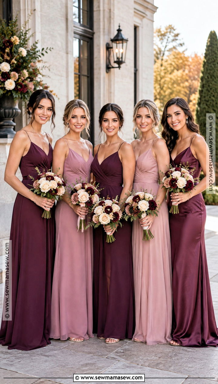
Plum, mauve and blush step from deep purple down to soft pink, and the step only looks deliberate when the undertones match. A bright, blue-based pink next to a muted plum looks like two different weddings. Flowing chiffon suits early fall; matte satin and crepe give a more structured feel for a formal evening. Silver, pewter or soft gold shoes all work with this palette, but pick one metal for the whole group. Crystal earrings, slim bracelets and bouquets of ivory, dusty pink and berry flowers carry the tones through. I like giving the maid of honor the plum so she stands out quietly, then spreading the mauve and blush across the rest. Purples also hold their color well under indoor lighting, which isn't true of every pale shade.
5. Navy Slate and Dusty Blue Bridesmaid Dresses
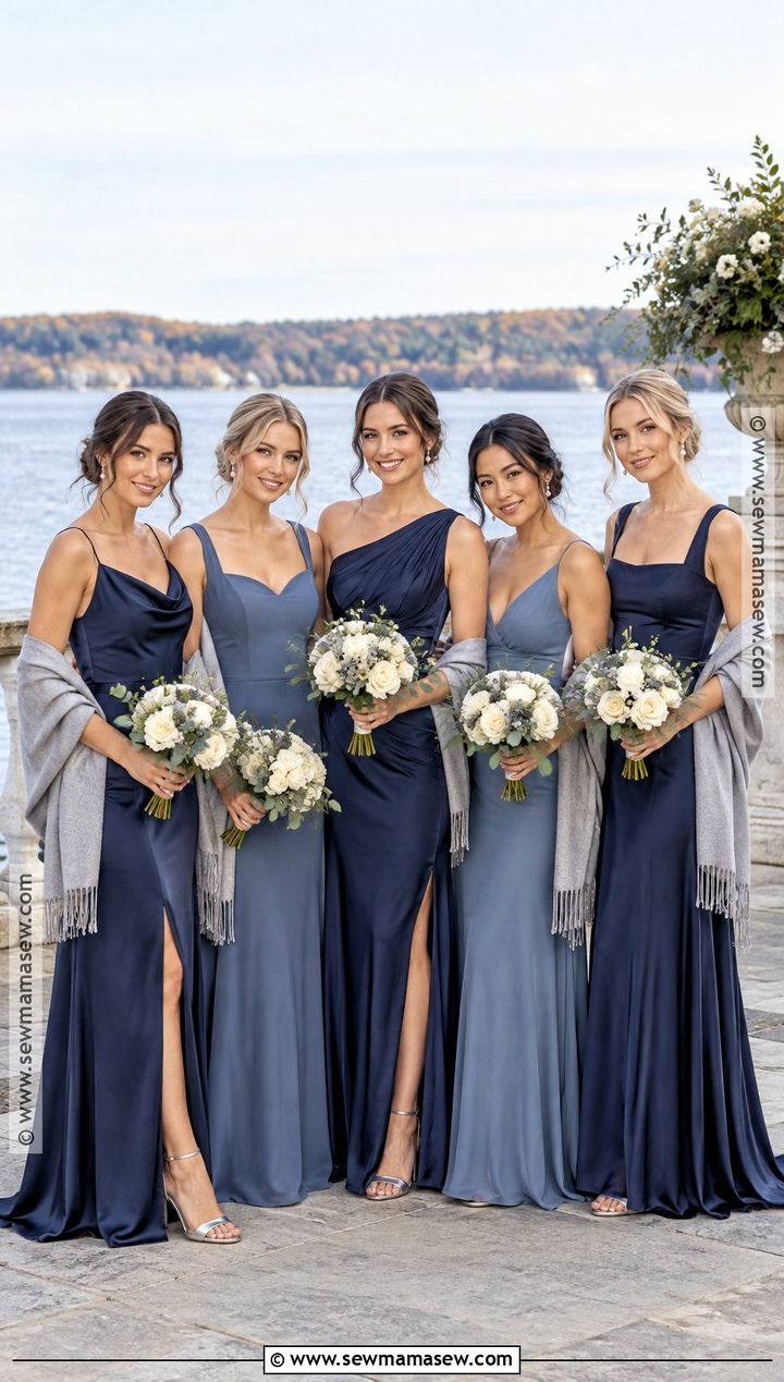
If the bride is tired of orange and red, a blue range is the obvious way out of the usual fall palette. Navy anchors, slate adds depth and dusty blue lightens the row. Related shades like these look random in mismatched fabrics, so I keep everyone in floor-length satin or crepe and only let the bodice change; the skirt movement has to match. Silver heels, pearl or crystal earrings and small bouquets of ivory flowers with blue-green foliage suit all three. Gray wraps are the most practical cover-up here because they blend with every blue. Navy also has an advantage most palettes don't: it coordinates directly with navy suits and gray tailoring on the groom's side, so the whole party reads as one.
6. Emerald Burgundy and Gold Bridesmaid Dresses
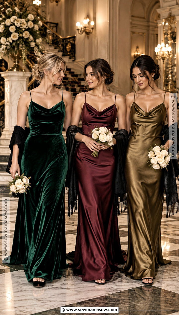
Emerald, burgundy and gold are three loud colors, so the dresses themselves have to be quiet. I'd choose sleek floor-length velvet, satin or structured crepe with almost no embellishment. Gold is the tricky one: a bright metallic lamé can look like costume beside velvet, so I prefer an antique-gold satin and only on one or two bridesmaids. Black or bronze heels, small gold earrings and compact cream bouquets are enough. Black wraps keep the evening reception polished when the temperature drops. Alternate emerald and burgundy down the line and put the gold dress near the center, where it reads as a highlight instead of an afterthought. Grand hotels and historic rooms with dark wood carry this palette best.
7. Copper Caramel and Espresso Bridesmaid Dresses
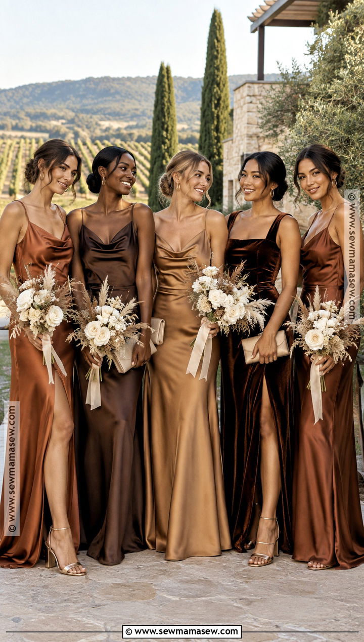
A brown palette sounds dull until you see the fabrics doing the work. Copper satin catches light, caramel crepe sits in the middle, and espresso velvet absorbs it, so even three related browns end up with real contrast. Keep the dresses long and streamlined; ruffles in brown tend to look heavy. Bronze heels, gold hoops and warm neutral clutches keep the tonal effect going. Bouquets need some lightness here, so I'd use ivory flowers, dried grasses and restrained greenery rather than deep florals that would vanish against espresso. Outdoors, put espresso beside copper instead of grouping the darks. Lofts, vineyards and contemporary barns are where this palette looks modern rather than drab.
8. Maroon Burnt Orange and Ochre Bridesmaid Dresses
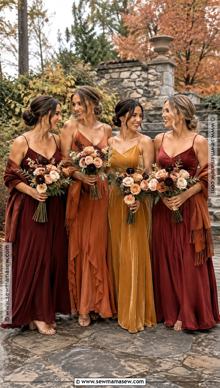
Maroon, burnt orange and ochre is the boldest of the foliage palettes and gives each bridesmaid a clearly individual color. Fabric matters more than usual: matte satin, crepe and chiffon can share a lineup only if their weights are close, and I check that by holding the swatches up and watching how each one hangs. Choose either ankle or floor length for the whole group, never a mix. Tan block heels are kind on grass and gravel. Gold earrings and rust wraps reinforce the warmth, and cream and peach bouquets with a touch of burgundy cool it slightly. Keep the ochre softened and golden; a bright yellow version goes neon in photos. Brick, stone, raw wood and desert settings all suit these colors.
9. Teal Rust and Champagne Bridesmaid Dresses
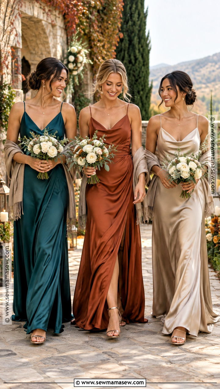
Teal and rust sit opposite each other on the color wheel, which is why they need champagne between them as a neutral bridge. Use deep teal, not bright turquoise, or the palette starts reading as summer. Rust in matte satin or crepe and champagne in chiffon or a lightly textured fabric gives the row some variety without losing unity, as long as the skirts are all floor length and the bodices equally simple. Bronze sandals, delicate gold jewelry and ivory bouquets with blue-green foliage tie the colors together. For warmth, a rust wrap or taupe shawl avoids introducing a fourth color. Spread teal and rust evenly down the line. Bohemian venues and outdoor sites with a lot of leaf color suit this mix.
10. Black Burgundy and Bronze Bridesmaid Dresses
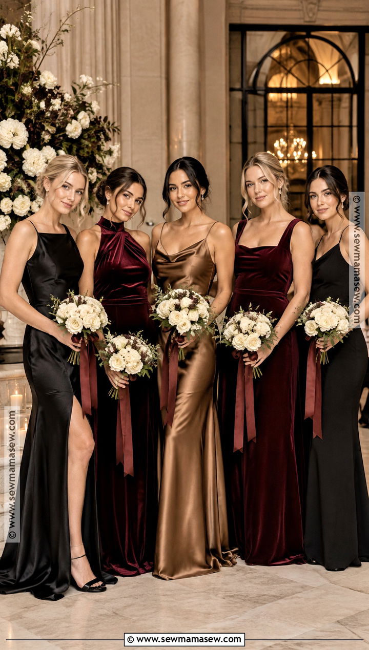
Black bridesmaid dresses still worry some families, but black, burgundy and bronze is one of the most polished combinations for a late fall evening. Black sets the base, burgundy brings the color, and bronze adds a little shine. Floor-length satin, velvet or crepe all work, provided the structure is similar; a soft chiffon black beside a stiff satin bronze looks mismatched. Necklines can differ as long as they stay simple. Black heels, small gold earrings and compact ivory bouquets tied with burgundy ribbon finish the look. I'd steer away from sequined bronze, since one sparkly dress pulls every eye in the photo. Giving bronze to the maid of honor marks her out gently. Ballrooms, museums and historic hotels are the natural setting.
11. Aubergine Forest Green and Copper Bridesmaid Dresses
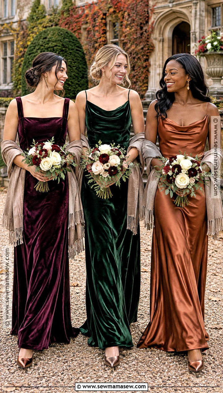
Aubergine, forest green and copper is the palette I suggest for a couple who wants jewel tones without the obvious emerald and ruby. Aubergine reads as a deep purple, forest green adds an earthy note, and copper brightens the group without tipping it toward summer. Velvet suits a cold-weather date; satin or crepe is lighter if the forecast is mild. Bronze closed-toe heels, gold drop earrings and ivory bouquets with burgundy accents carry it, and taupe wraps unify the group for outdoor photos. Skip heavy embellishment entirely, because the colors already do enough. Greenhouses, mountain lodges and historic estates give these shades a fitting backdrop.
12. Floral Berry and Green Bridesmaid Dresses
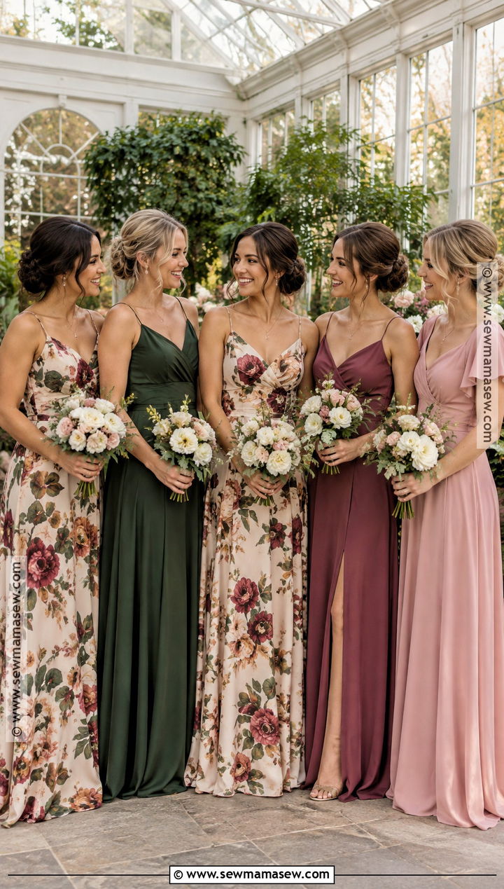
Prints can join a solid lineup, but only when the print literally contains the solid colors. I'd put one or two bridesmaids in a floor-length floral with berry, olive, cream and muted rose, then dress the rest in solid berry, forest green or dusty pink pulled straight from that pattern. Hold the print swatch against each solid before ordering; a green that's slightly off from the print is more visible than a completely different color. Keep fabrics in one family, or at least with a similarly soft finish. Neutral heels, fine gold jewelry and simple ivory bouquets stop the group looking busy. Place the floral dresses between solids so the pattern spreads evenly. This suits garden venues, conservatories and relaxed early fall celebrations.
13. Sage Lavender and Dusty Rose Bridesmaid Dresses
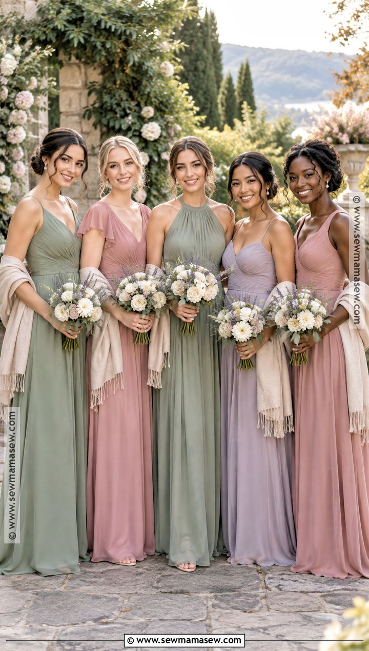
Sage, lavender and dusty rose are for a September or early October date when dark jewel tones would feel too heavy. The secret is keeping all three at the same softness: sage that leans gray-green, lavender that's dusty rather than bright, and rose that's slightly muted. Once one shade is clearer than the others, it jumps out of every photo. Floor-length chiffon with a flowing skirt suits these colors, and each bridesmaid should choose a neckline that gives her the coverage and support she needs. Nude, champagne or pale gold heels keep it delicate. Pearl earrings, small bracelets and cream bouquets with restrained lavender and blush accents finish it, and beige wraps are useful once the evening cools. Gardens and light-filled barns are ideal; a dim reception room flattens pastels.
14. Mocha Taupe and Champagne Bridesmaid Dresses
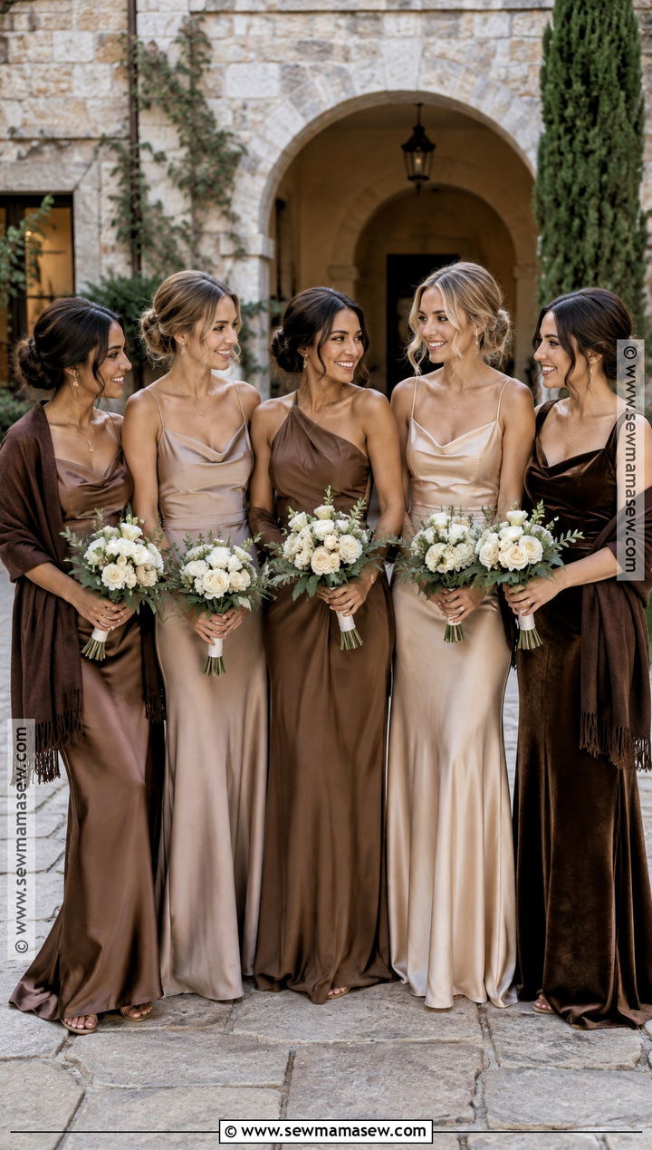
Mocha, taupe and champagne is the easiest palette to coordinate with fall décor, and the hardest to keep separate from the bride. Everything depends on contrast with her gown, so I always choose champagne with a clear beige or gold undertone, never bridal ivory. Mocha anchors the group and taupe connects light to dark. Because there's no strong color, texture has to do the work: satin, crepe and smooth velvet side by side give the row depth without prints. Nude or bronze heels, minimal gold jewelry and cream bouquets with fresh greenery keep it calm, and chocolate or taupe wraps cover the outdoor portions. Modern venues, galleries and stone courtyards suit this tonal look far better than a rustic barn, where it can blend into the wood.
15. Sapphire Emerald and Ruby Bridesmaid Dresses
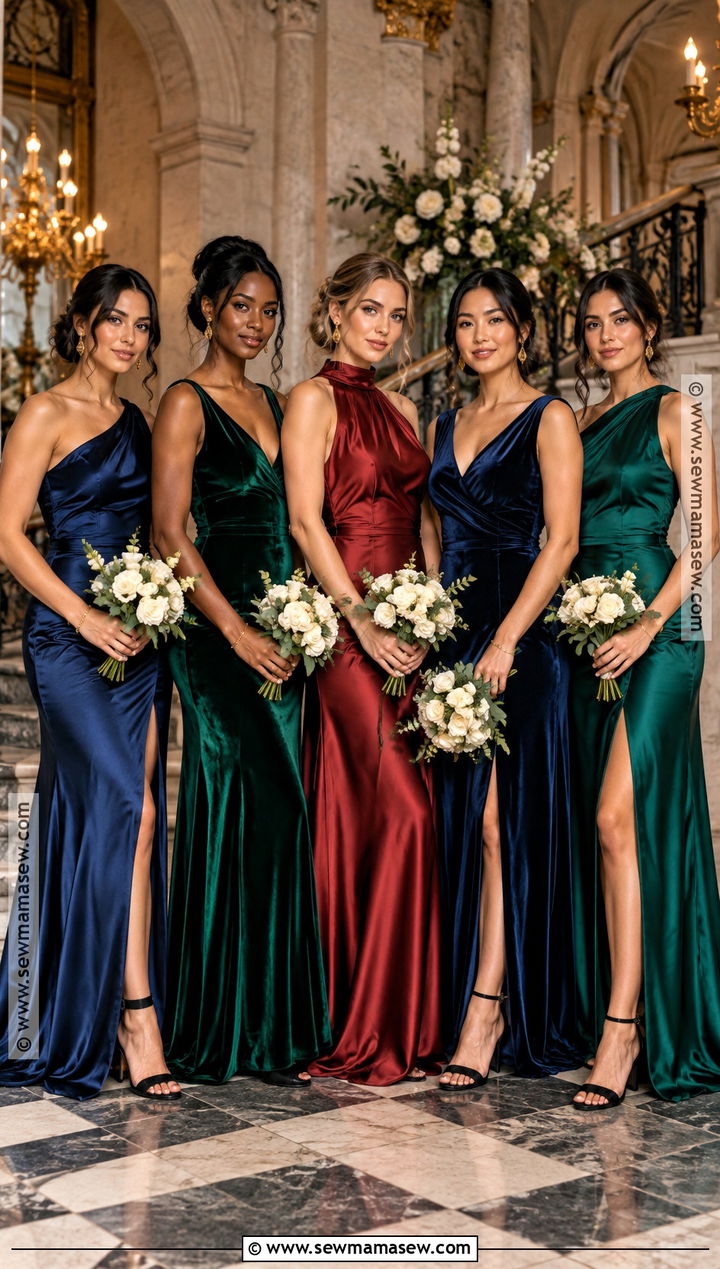
Sapphire, emerald and ruby is the most formal palette on this list, and saturation is everything. If one dress is a shade paler than the other two, it looks faded rather than lighter, so I compare all three swatches together before anyone orders. Floor-length satin or velvet photographs richly under both daylight and indoor lighting. Keep the silhouettes simple, with one-shoulder, V-neck, high-neck and wrap bodices as options. Black heels, matching gold jewelry and ivory bouquets give the colors room. Alternate the shades in the lineup for balanced group photos. Save this one for a ballroom, a historic property or a late fall evening with a black-tie or formal invitation; at a casual venue it looks overdressed.
Who Wears Which Shade in the Lineup
Once the palette is settled, the next question is who wears what. Brides often assign colors by height or by friendship order, but I'd rather look at each person's coloring first. Someone with warm, golden skin usually looks better in rust, mustard, copper or olive, while cooler complexions tend to suit plum, sapphire, navy and dusty blue. Deep skin tones carry saturated jewel colors and rich browns very well, and very fair skin can look washed out in pale champagne or sage under overcast light.
When the lineup has very different heights
Put the darkest shades on the tallest bridesmaids and at the ends of the row; it frames the group. Lighter shades toward the middle draw the eye to the bride. If one person is much shorter, avoid giving her the only pale dress in a row of darks, because she'll read as a gap.
Pregnant or curvy bridesmaids
Let them pick fabric before color. Crepe and matte satin hold their shape over curves without clinging, and a wrap or empire bodice adjusts well for a growing bump. Thin, shiny satin shows every seam and undergarment line, and that is far more noticeable in close photos than any color choice.
Finally, ask everyone to try a swatch against their face before you lock the assignments. It takes ten minutes and saves someone spending the whole day in a shade that makes her look tired.
A Mismatched Party Still Needs a Rulebook
Every good mismatched bridal party I've seen follows a clear set of rules underneath the color. Pick three or four shades with compatible undertones, compare physical swatches in daylight, and fix the length, fabric weight, shoe color and metal before anyone shops. Inside those rules, bridesmaids can choose silhouettes that fit their bodies and comfort. Greens, berries, burnt oranges, warm neutrals and jewel tones all suit autumn when the order and proportions are planned. Factor in the venue, the likely temperature, the formality on the invitation and the décor before you lock the palette, and the group will look coordinated while each bridesmaid still looks like herself.
Related posts: